October 17, 2009
Create and design for interface
Information Architecture
Blueprints for the web
By Christina Wodtke
Gurus and Rules
In which some people like to boss you around, when we know that’s my job.
The Rules
- Users don’t read. use as little writing as possible.A clearly visible print button, allowing the reader to choose onscreen or off-screen reading, accompanies short stores. Instructions should be brief, legible, located in the same visual area as the item they are informing, and written in the language of the person trying to understand them.
- Users don’t scroll. Don’t make your pages scroll.Understand the nature of your site’s users, business, and content, and you can create a successful design.
- Font size “1” should never be used. No one can read it.Use a visual hierarchy to communicate the importance of each page element.
- There should be a maximum of seven links on each page: more than that and we lose the user. It’s just too many choices.Use your visitors’ vocabulary for labelling to promote easy understanding and recall. Design a clear page hierarchy; guide the users’ eye across the page with your design. Prioritize your page elements. Not everyone gets to be above the fold.
- Users won’t click on items they belie are advertisements. Banner ads work only if they appear on the right side of the page.Make ads contextual and useful if you want people to click on them.
- Three goals of a site have to be identified to determine the direction and voice for the site.
- What are the business goals? Customer loyalty? Investor excitement? Avoiding going over budget?
- What are the engineering goals? Easy to maintain? Extensible? Avoiding having to rebuild the current infrastructure?
- What are the sales goals? More banner space? Customized pages for co-branding opportunities?
- What are the marketing goals? Reinforced branding? Gather customer feedback?
- What are the user’s goals? I want to learn? Find? Buy? Say hi to a friend? Get my work done quickly?
The process of answering questions is called requirements gathering, and no site should be built without it. Do requirements gathering before you start designing a site.
The Tao of the page
Principle
- Simplicity and Elegance.
Each element on your page should have a purpose. It is communication every element on the page has a job to do.
- Proximity and Relevance.
As you design, you have to be careful to place related items together and code them as belonging together.
Vocabulary in your visual code can be:
- A shared space on the page, such as a box
- A shared colour palette, font, or visual weight
- Placement next to each other
- Distance from unrelated items (increasing whitespace between disparate elements makes the similar ones appear even more together).
- Focus and Feedback
When users embark on a task. Make sure the layout focuses on helping them succeed in that task. Remove unnecessary items from the screen and make certain each action has clear feedback.
- A hierarchy of importance, a hierarchy of task set clear priorities in the requirements gathering phase, and you will return to them again and again-in your categorization choice, in your interaction design, and here, in interface design.
- The right tool for the right job
Pick your widgets carefully.
Navigation – Windows, Doors, and staircases.
Using a different colour, the easiest way to make a link stand out is simply to make it a different colour than the text it’s nestled within.
Tog on Interface
Bruce “TOG” Tognazzini Apple Computer, Inc.
Process
The Design Process
Understanding your own preferences, talents, and abilities is key to understanding your users’.
- Begin your project with field analysis.
- Field analysis continues with planning sites, alpha sites, and beta sites. All are vitally important to the design process.
- Brainstorming is vital to the task of casting off old ideas and embracing new ones.
- Use scenarios to define and develop a sense of the user space.
- Prototypes can and should be created in a matter of days, not weeks or months.
- Inexpensive testing should be done by members of the design team as part of a cooperative effort to produce the best software possible.
- The work to design and build the keyboard interface should not sap resources that are needed for the creation of the visual interface.
- Be wary of rationalization, assumption, and denial creeping into the design process.
- In the earliest stage, design the new software to be the best it can be with little concern for the existing system.
- Use peer design review to infuse fresh ideas and explode false assumptions that may have crept into your design.
- Toward the end of the design period, test the new software to find out where current users will become tripped up.
Objectively weigh every new feature against any resultant increase in the learning burden. Then either:
- Include the feature anyway
- Throw it out because it is disruptive and not clearly more productive.
- Modify it to get the same effect without torturing current users.
Guidelines that make the interface “visible”
- People need visual landmarks to act as anchor points.
- All movement to subordinate windows should leave the primary window open and visible.
- All Macintosh interface objects can be seen, heard, felt, or otherwise directly sensed by the user. There should be no abstract, invisible objects in the interface, ever.
- People don’t want the most abstract interface. They want multiple channels of information. The more visual, verbal, vocal, tactile the interface is, the more natural it feels, the more feedback and response it provides, the more confidant the user becomes.
- The system image is an illusion designed to convey the design model. Have it communicate the design model clearly and concisely.
Colour
Use relative colour to enable a user to swiftly change anything from a single object to the total environment to an entirely new colour scheme without having to change any individual element and without having to rely on any presets.
Vocabulary
Words like ”kill”, “abort”, and “default” have powerful emotional charges connected with them and have no place in the interface. Instead, use words like “stop,” “cancel,” and “standard.”
Guidelines for agents
- Don’t pretend the computer is human.
- Constrain the user’s expectations to match the abilities of the agent.
- Constrain the agent to performing tasks it is capable of performing.
User guides
Conceptual modes and the system image
- People don’t want the most abstract interface. They want multiple channels of information. The more visual, verbal, vocal, tactile the interface is, the more natural it feels, the more feedback and response it provides, the more confidant the user becomes.
- Keep it simple. The more of them that can be conveyed graphically, the better.
- Keep it safe. Don’t let the users fall off the edge of the Earth: one dark little corner with a short-cut key that lets the users initialize their hard disks will permanently undermine a million work-hours of friendly software design.
The user should be in control.
- The user’s sense of control arises from neither tyranny nor anarchy but from the freedom of a supportive environment constructed of reasonable and consistent rules.
- Perceived stability: users feel comfortable in a computer environment that remains understandable and familiar rather than changing randomly.
- Keep behaviour consistent. The same action on the part of the user upon the same class of object should result in the same behaviour on the part of the system.
- Develop a simple, smooth design model, reflective of the needs of the user, not the limitations of the hardware or the difficulty of the coding process.
- The system image is an illusion designed to convey the design model. Have it communicate the design model clearly and concisely.
- Make the application memorable by reducing the user’s need to memorize.
- Reflect the illusion of the interface, not the realities of the hardware.
- Use big concepts.
- Reduce or eliminate navigation.
- People want clear, visual communication.
- People need visual landmarks to act as anchor points.
- All movement to subordinate windows should leave the primary window open and visible.
- If all else fails, offer maps.
- Provide a unifying them.
- Be wary of interface elements that detract form or overwhelm the content regions of your application.
Menus
- The menu bar should never, ever, be removed unless there is a powerful, overriding reason to hide it.
- Use icons in the menu bar only as menu titles.
- Devise menus that change to reflect the current mode of the system.
- Use a single menu bar and do not allow more menu titles in the menu bar than visible space permits.
- The menu bar needs to be improved by enabling menus from within modal dialogs, by placing the menu bar on the same display as the mouse, and by giving users better feedback as to what application they are in.
- Pop-ups and other temporarily opened objects could be improved by adding borders.
Icons
- Use icons in the menu bar only as menu titles.
- Make all icons require double-clicking.
- Make any iconic-looking object that requires a single click also accept a double click.
- Make all document icons look like documents by including the folded-down corner.
- Make all file containers look like containers.
- Make all application icons look different from documents and file folders.
Default Buttons
If you have a button in a dialog box that is activated by pressing the Return key, it must be circled. If you don’t have a default button, don’t circle any button.(you may have to trick the system into not supplying a default button by not using the button the system assumes to be the default.)
Fonts
- Command < reduces the size of selected fonts by one and
- Command > increases the size of selected fonts by one.
Error Messages
System-level error messages should state the assumed problem, then offer the alternative possibility that the messages-giver has gone berserk.
Version Numbering
- Use the release name as part of all file names.
- Never display more of a version number than the user needs.
July 29, 2009
Visceral Design
Life Style Boards
Understanding customer needs
Designers use many tools to help them understand and visualize their customer’s lifestyles, market segments, product attributes, and user scenarios.
Lifestyle image boards – help designers understand and categorize certain aspects of their customers and their customer’s lifestyles, they also help to sell design decisions to “design- challenged” middle managers.
Product attribute boards – can be used in research to understand what the customer wants the product’s design personality to be. They also help designers look for successful visual cues that can be leveraged into their product. Product attributes can include “tough, reliable, solid, compact, trendy, timeless, portables, sleek, speedy, futuristic, familiar, organic, warm/cool, friendly, easy-to-use…
Ethnography testing – is the study of a group of living people – how they live, how they interact, what they believe, how they behave, what kinds of objects they use, and what they do.
Market segments – is research is the cat of separating customers or users into different “buckets” based on their different needs. A few obvious categories could include: geography, age, affluence, frequency of use, place of use, or industry.
Demographics – characterizes your customers: age, income, marital status, race, and education…
Focus group research uses group discussion (and dynamics) to learn about a topic and/or product.
Qualitative research (how and why) – is used to gain understating of how customers feel about a topic and why they feel that way. Here the data is attitudes and impressions rather than numbers.
Quantitative research (empirical data/percentages) – is much more statistical, it is usually conducted to measure and collect data from a representative sample.
Developing a powerful store image through effective visual merchandising
“You never get a second chance to make a first impression” (by Donna Geary).
Visual merchandising is comprised of six components: Image, layout, presentation, signing, display and events.
The Image – makers
- An identifiable store name
- A powerful visual trademark
- An unmistakable storefront
- An inviting entrance
- A consistent and compelling store look and hook

Inereative Design Guidelines:
Aesthetically Pleasing – the quality, appropriateness and attractiveness of all elements directly communicates those attributes about an organization, and graphically reflects the subject and/or users.
Clarity, simplicity & Transparency – visually, conceptually, linguistically and functionally clear. clear communication through elements of visual and sound design. only provide elements that are required. allow the user to focus on the task.
compatibility – any product needs to be presented in a way that is compatible with: the user, task, product. Adopt the users perspective. technical implementation should adopt appropriate standards that do not unnecessarily restrict future developments.
comprehensibility – interactivity and motion should flow in a sensible order, that is easy to recollect and in context, sound and visuals should support the message or goal. any system established should be easily learned and understood. the user should know:
- what to look at
- what to do
- when to do it
- why to do it
- how to do it
Configuration & Flexibility – permit easy configuration and reconfiguration. this not only refers to technical systems, but the interface to give the user a sense of control and involvement.
Consistency & Predictability – a system should look, act and operate the same throughout from the users perspective. the user should also be able to anticipate the result of actions and the information delivered.
Control – user must have (or feel to have) control over the interaction, with the context of information consistent with the users perspective. to achieve goals, the interaction should be flexible and compatible with the users skills, experiences, habits and preferences.
Directness – provide the most direct and intuitive ways to accomplish tasks and access information.
Forgiveness – prevent errors occurring where possible, when errors do occur minimize negative effect and supply constructive messages. don’t blame the user! recovery from a problem should be easy.
Response – system must acknowledge and respond to the users request or actions. the more immediate the better.
Trade-offs – final design of any product is a trade-off of conflicting design principles.
the resolution should be guided by the users:
- Expectations
- Understanding
- Experience
- Needs
This is an example of demographic of unclear family profile, the ads used Visceral response, it does well that audiences doesn’t need to study it, it sent intimidate massage across to demographics, that you need a Internet for you and the next generation, as a tool.
Reflective Design: is about the meaning of things.
Behavioural Design: the concept that focuses on how a structure or system, as viewed by the users, meets their needs and requirements.
Visceral Response – is about designing for affect rather than for aesthetics alone.
Visceral experience leads directly and universally to emotional response, emotions change the way the human mind solves problems.

the three levels of processing
The Viseral in Art:
Artist throughout human history have used the visceral response in their work. Below are images of Meret Oppenheim .

Meret Oppenheim fur-covered cup, saucer, and spoon 1936
The cup is sensuous, luxuriant, and inviting at the same time it is repellent as it is a skinned animal, hair in the mouth and on the hands, and erotic as all of these. The sculpture cleverly evokes many associations and emotions at once.
This artwork dominated the Surrealist scene in 1929. The Surrealists were trying out the metaphor to capturing the images of the dream in reality, crystallizing objects of desire, and affirming the magic link between the unconscious and the real world.
Apollo and Daphne Gianlorenzo Bernini marble sculpture 1622-24

Gianlorenzo Bernini – (Born Dec. 7, 1598, Naples, Kingdom of Naples — died Nov. 28, 1680, Rome, Papal States) Italian architect and artist credited with creating the Baroque style of sculpture.
His works often represent a fusion of architecture and sculpture, as in the Cornaro Chapel, in Santa Maria della Vittoria, Rome, with its celebrated theatrical sculpture, The Ecstasy of St.
This artwork that viscerally affects to me as reflects of cultural background of Rome gloriousness, beauty, religion.
DADA Movement
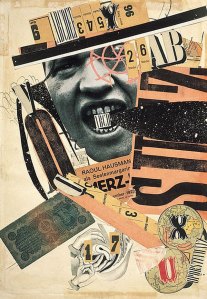
DADA movement Raoul Hausmann, ABCD, 1923-1924
Dada presents a challenge to art and the Visual. ‘Anti-art’ movement of the early 20th Century, rebelling against traditionalism of art and consumerist society.
Art as non-art. Utilizing new techniques in myriad mediums, jarring juxtapositions, collages, and nonsensical writings. Also, various abstract art styles develop during the 20th century, as the realm of the real in art has been taken over by photography.
Dada or Dadaism is a cultural movement that began in Zürich, Switzerland, during World War I and peaked from 1916 to 1922.The movement primarily involved visual arts, literature—poetry, art manifestoes, art theory—theatre, and graphic design, and concentrated its anti-war politics through a rejection of the prevailing standards in art through anti-art cultural works.
Dada activities included public gatherings, demonstrations, and publication of art/literary journals; passionate coverage of art, politics, and culture were topics often discussed in a variety of media. The movement influenced later styles like the avant-garde and downtown music movements, and groups including surrealism, Nouveau réalisme, pop art, Fluxus and punk rock.
DADA is the groundwork to abstract art and sound poetry, a starting point for performance art, a prelude to postmodernism, an influence on pop art, a celebration of antiart to be later embraced for anarcho-political uses in the 1960s and the movement that lay the foundation for Surrealism. —Marc Lowenthal, translator’s introduction to Francis Picabia‘s I Am a Beautiful Monster: Poetry, Prose, And Provocation.
Andrew Warhola

Andy Warhol self potrait
Andrew Warhola (Rusyn: Андрій Варгола, August 6, 1928 – February 22, 1987), more commonly known as Andy Warhol, was an American painter, printmaker, and filmmaker who was a leading figure in the visual art movement known as pop art. After a successful career as a commercial illustrator, Warhol became famous worldwide for his work as a painter, avant-garde filmmaker, record producer, author, and public figure known for his membership in wildly diverse social circles that included bohemian street people, distinguished intellectuals, Hollywood celebrities and wealthy aristocrats.
Damien Steven Hirst

Damien Hirst Virgin mother
Damien Steven Hirst (born 7 June 1965) is an English artist and the most prominent member of the group known as “Young British Artists” (or YBAs) and is reputed to be the richest living artist to date.
Virgin Mother as a massive sculpture depicting a pregnant female human, with layers removed from one side to expose the fœtus, muscle and tissue layers, and skull underneath. This work was purchased by real estate magnate Aby Rosen for display on the plaza of one of his properties, the Lever House, in New York City.
Death is a central theme in Hirst’s works. He became famous for a series in which dead animals (including a shark, a sheep and a cow) are preserved—sometimes having been dissected—in formaldehyde. The Physical Impossibility of Death in the Mind of Someone Living, a 14-foot (4.3 m) tiger shark immersed in formaldehyde in a vitrine became the iconic work of British art in the 1990s,[4] and the symbol of Britart worldwide.
Marco Evaristti
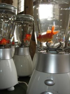
live Gold fish in blender
Marco Evaristti (born 1963 in Santiago, Chile), is an artist who has lived in Denmark since the 1980s.
After studying at the Royal Danish Academy of Fine Arts, Evaristti gained notoriety for a museum display entitled Helena in 2000 that featured ten functional blenders containing live goldfish. The display, at the Trapholt Art Museum in Kolding, Denmark, invited guests to turn on the blenders. This led to museum director Peter Meyer’s being charged with and, later, acquitted of animal cruelty.His aim is to raise awareness of environmental degradation.
Bad Art and Non-Art produced in the 20th century. At best it’s ugly, revolting, superficial, and spiteful. At worst is is an intellectual vacuum wearing a mask of public acclaim (a public composed of a few “art experts” whose first principles are that art is anything, everything, and nothing, that beauty is passe’ and that subjects and meaning are obsolete and a naive concern). With their help, the “artists” of today fill our museums with expensive garbage designed to obliterate the very meaning and purpose of art.
Brian Yoder
Here are some example of Visceral responses by Nestle, the ads aimed emotional hook audience that refers to von Restorff Effect: to increased likelihood of remembering. and is also the primarily the result of the increased attention given to the distinctive items in a set, where a set may be a list of words, a number of objects, a sequence of events, or the names and faces of people.
June 19, 2009
D1-2 Storyboard Development
Design and storyboarding tool
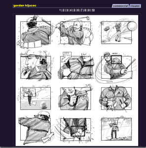
Be able to illustrate all the individual frames that make up the shots in a shooting script either for commercials, industrials films/multimedia, animated feature films, or animation used in commercials, industrials, or educational films. All these genres use storyboards in one from or anther.
Storyboarding requires artists have a good grasp of interpreting other people’s thoughts, my drawing ability must be developed thoroughly in both rendering live-action images realistically and in interpreting images as called for in animated films or videos. I must be comfortable expressing myself clearly and creatively to my audience.
Stills from historically important films-from silent to sound- will be sued throughout the text to illustrate their inherent design qualities and “stopped action” (actually parts of a storyboard, called shots or stills from “key frames.
Above information from book – The Art of the Storyboard,
written by John Hart.
Resource from http://www.storyboardsinc.com




May 5, 2009
TAFE Activity
The Element of Texture
Texture can be real or simulated, can form a surface, can be natural or man-made, can achieve emphasis, can be affected by lighting conditions.
understanding the difference between Physical and Visual texture helps us take full advantage of this element.
Physical Texture; is the tactile texture you can physically feel. texture is psychologically powerful. many people and especially children learn about the world through touch. for example, it is very tempting and some are overcome by the temptation to touch artwork in art galleries. Artist can use physical texture to persuade and, or evoke emotions in the viewer.
Visual Texture; is the illusion of physical texture, created with the materials you use. in painting, paint can be manipulated to give the impression of texture, for example, the texture of a leaf. photoshop and Painter are powerful tools to create countless visual textures.
Here is the Excise be given as class Activity. To develop an understanding of texture. The ability to comprehend the content and demonstrate an ability to design appropriately to the content

Texture
March 22, 2009
Yan’s Blog – Personal Style Guide
Design; the form fits function industrial outlook mass production. A discipline embraces functionality. Embellishment is reduced; push the boundary of design concept. Jeffris Elliott.jpg
Statement A: References from book
“The art of looking sideways” written by Alan Fletcher:

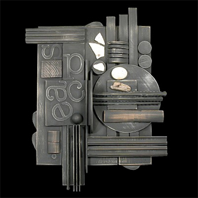
Things that catch my eye, Ammonites in Morocco, votive offerings in Sicily, Paper cuts in Hong Kong, glass pens in Tokyo. That sort of thing. I’m intrigued by useless information such as that eight per cent of the population is left-handed, that giraffes only sleep five minutes every twenty-four hours, that Italians kill twice, the Swiss three times. I enjoy encountering incongruities-a sign announcing ‘Blue Movies in Full colour’. To look at things from unlikely angles. References to sources are occasionally provided to keep you going.

Statement B:
What is LINE, how to apply it within FONTT or Type, referring to Principles and Elements Design?
In this statement, the argument is that humans have a specific performance to a pro-portion aspect ratio. The follow images that I’ve captured from http://www.iainclaridge.co.uk/blog/
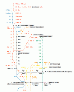 Symbolic Form
Symbolic presentation uses to convey complex technical information or highly abstract concepts that must be made clear to others.
This symbolic drawing has coded meanings that must be learned in order for the drawing.
 Geometric and Organic Form This is a example of Types of Form
Geometric forms are made up circles, triangles, or combinations of these. Each shape has unique characteristics. Whereas the circle is equal in all directions, the lines of a square and a triangle continually move our eyes in various directions.
Organic Form is fluid in appearance and nature has an abundant supply of organic shapes and patterns that has long been an inspiration and source of objects of representation.
 Literal Form presentation presents an object or concept through detailed realism without unnecessary embellishment and exaggeration. It can be based on observation of an object and provide a record of subtleties in a complex form. This method allows the audience to understand the form through examination and comparison of its parts.
 Abstract Form presentation involves deliberate simplification, often with exaggeration. This method can be based on observation of an object or can explore relationships among form alone, without direct observation. It is particularly useful for depicting difficult concepts, ideas, and observations because it excludes unimportant areas and focuses attention on parts critical to the meaning.
Whether geometric or organic, all form is built on basic elements: dots, lines, planes, and volumes

Plane refers to an area outline or defined by a grouping of images, type, symbols, or markings. It is an expression of height or width.
 Volume
It is a product, lines and planes. It refers to the illusion of a three-dimensional form on a two-dimensional surface, and the illusion of space within a form. Volume of the first type is created through the grouping of several dots, lines, or planes.
 Characteristics of Form
This is an example of characteristic of form: Whether literal, Abstract, or symbolic, organic or geometric, all two-dimensional form has visual characteristics. Visual characteristics are size, shape, texture, and colour
 Space
Space
Around elements can help to define and emphasize objects and give meaning to the entire form. The positioning of the letters seeks to echo their visual qualities and variations.
Space can became active through its shape and position in the composition, and evoke association and movement.
 Texture In two-dimensional form, texture is visual and not tactile. Visual texture can be defined as the sum of visual components that create a plane recognizable as a unified grouping. All two-dimensional forms portray a texture however subtle or pronounced. Colour as relating to hue has many unique characteristics. One characteristic of colour that is present in the corresponding figures is value (light and dark)
 These are some of my work personal-styleguide1,2,3.jpg
The concept of Principles and Elements refer to Visual weight and Balances, Depth and perspective. In the exercise I was trying to achieve by use perspective to create a sense of movement among forms, use prioritizes ideas and information.



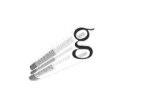 Type is a crucial element for any design in which it appears-and it is used in most graphic designs. The viewer in several ways simultaneously: as shape, and as a purely visual element in which the letterforms themselves convey a feeling or a meaning. By Bryan L. Peterson
To investigate the fundamental concepts of design
The Elements of Design:
Line
Line varies in direction, defines contour or the edge of an object, creates the illusion of space and form, and creates a pattern when repeated. Line has varying characteristics, e.g., thick and thin, long and short, and curved and straight.

Shape
Shape creates pattern when repeated, can be organic or geometric, can be positive or negative, creates rhythm when repeated, creates emphasis when varied in size, creates balance when varied in placement, can be objective or non-objective, can be distorted or extended.
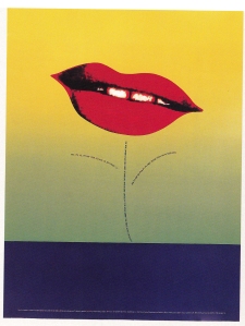
Form
Form is shape with dimension, can be balanced symmetrically or asymmetrically, can be open or closed, when repeated creates pattern, can be organic and/or geometric, can be studied for its historical and cultural significance.

Colour
Colour can be mixed from red, yellow, and blue, can be combined to make new colours, can be mixed for intensity and value, can express moods and feelings, can be warm or cool, can give the illusion of distance.
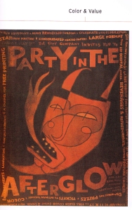
Space
Shape can be displayed by overlapping spaces, can be displayed by color, can be two or three-dimensional, can be distorted, can be positive and negative, can be shown by proposition.
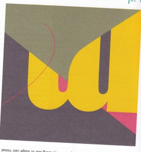
Texture
Texture can be real or simulated, can form a surface, can be natural or man-made, can achieve emphasis, can be affected by lighting conditions.
 Value
Value
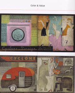
Value can be created by the manipulation of media, can be expressed through a variety of media, can create movement, can separate a surface, can create an illusion of depth, can be the lightness or darkness of media.
Principals of Design:
Balance
Balance is the weighted relationship between the visual elements.

Composition
Composition is the organization of the elements of design into a unified whole.

Emphasis or Dominance
Emphasis is the focus of attention in a composition.

Harmony
Harmony is the unity of all the visual elements in a composition.

Proportion
Proportion is the ratio of one part of the composition to another.

Repetition
Repetition is the use of an element or elements more than one time in a single composition.

Rhythm
Rhythm is the repetition of an element to achieve movement in a composition.

Unity
Unity is the organization of elements and principles into a whole.

Variety
Variety is the differences among and between elements in a composition.

Contrast
Contrast where there is distinguishable difference between objects. This may be in shape such as the letter “s” and the letter “l”. Or it may be in contrast in tone, colour, mass etc.

Economy
Economy is the intentional removal of elaboration. Only the elements that have a purpose remain.

Career Plan 2009
As a part of requirements for IDD studies to research and plan my future career, on the 11th of February we have visited ballistic publishing: the Multimedia industry.


About Ballistic Publishing
We are dedicated to producing books of highest quality celebrating the talents of digital artists worldwide. Ballistic Publishing is an independent publisher based in Adelaide, South Australia, with offices in Melbourne (Victoria, Australia) and Tampa (Florida, USA).
http://www.ballisticpublishing.com/about/index.php
Supporters of the CGSociety
Ballistic Publishing proudly supports the CGSociety, the most respected and accessible global organization for creative digital artists. The CGSociety is committed to artists at every level by offering a range of services to connect, inform, educate and promote, by celebrating achievement, excellence and innovation in all aspects of digital art.
What is Ballistics business model? How do the designers contribute to this model?
Ballistics is an online Website Design Publishing company. An independent publisher whose based in Adelaide, South Australia, with offices in Melbourne and USA. Designers work with Multimedia software as tools to create graphic images that uses on website interface. To producing books of digital art work,
Also advertisement.
What is the designer’s role at Ballistic?
According by Jim’s (manager of Ballistic) information that work in Ballistic the designer’s roles are “ good attitude, always learning new skill and master the work knowledge”, good communication skills, show visual massage is very important.
Who do the designers have to work with?
In Ballistic, designers are work as a team, discuses work through each designer to work out what is the user needs and company needs, and also talk to client, to find the best solution that work effectively for the product.
How important is the interface of the website to the company?
A company whose had well-designed interface will attract audience attention which means they would be more likely to spend time on the site to find out important information of the company’s product, in results of increase the chance of selling more product.
What are future developments for the websites interface?
In future most company will choose to promote their product through websites which means more dements on use internet. Then interface will requires more powerful hard ware as well as soft ware: such as faster to downloads, larger format file with high portability visual result, potentially move from computer to mobile phone, Internet will provide more convenient website service.
Further Questions:
What does an interface designer do?
An interface designer is who to design and create computer program presents graphic images and information to user or receivers information from a user, in particular the layout of the screen and the menus, base on product.
What artistic and technical skills are interface designer requested to have?
An interface designer requires good design knowledge, whose creative, highly qualified skills of use multimedia soft ware to manipulate web site interfaces behaviour.
What specialized areas are there in multimedia that you could get a job in?
The area like Web site design companies, such as Ballistic. Advertisement industry, television industry, publishes companies, education system, programming systems. Designers, cartoonist, art directors, illustrators, Photographers, Creative Directors.
What resources are available to find multimedia jobs? (For example seek.com.au)
http://www.carrerdue.com.au/Media
http://www.jobsanzwers.com.au
http://multimedia.marin,edu/
http://employment.byron.com.au
What the currently available entry-level jobs?
What jobs are currently available in South Australia?
What jobs are currently available interstate?
What skills are these jobs requesting?
What is the salary of these jobs?
What professional associations are there for the Multimedia industry? (for example AIMIA)
What are the associations’ roles?
What is AGDA? What does it do?
Will you have learned these skills in this course by the time that you graduate?
Explain how you would be able to further your skills to meet the industry requirements?
There are many private educational providers and TAFE that offer specialized short-term courses from life drawing to 3D modelling and animation. Investigate and keep an active record of courses that may be of use to your professional development.
What your University options after this course?
After I am complete Advance diploma of Interactive Digital Design, I am planning to have further study Bachelor degree of Visual Communication – Graphic Design at SA University.
What industry events and conferences are coming in 2009 for MM people? For example (IDN world magazine holds regular design conferences all around the world.)
What industry awards and competitions are available for you to enter your work?
What resources such as magazines and websites are available to you?
How do you plan to apply for the available jobs?
Character and scene development
Project D1-3
Character and scene development
Principles and elements that i consider use for this project or future projects.
Fibonacci sequence
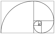
A Fibonacci spiral created by drawing arcs connecting the opposite corners of squares in the Fibonacci tiling; this one uses squares of sizes 1, 1, 2, 3, 5, 8, 13, 21, and 34; see Golden spiral. The golden section is a line segment sectioned into two according to the golden ratio. The total length a + b is to the longer segment a as a is to the shorter segment b.
In mathematics and the arts, two quantities are in the golden ratio if the ratio between the sum of those quantities and the larger one is the same as the ratio between the larger one and the smaller. The golden ratio is an irrational mathematical constant, approximately 1.6180339887.
At least since the renaissance, many artists and architects have proportioned their works to approximate the golden ratio—especially in the form of the golden rectangle, in which the ratio of the longer side to the shorter is the golden ratio—believing this proportion to be aesthetically pleasing. Mathematicians have studied the golden ratio because of its unique and interesting properties.
Here are some Fibonacci sequential images i have collected from internet:


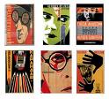
Research
In this part, i have collected examples of animation characters that suggests strong proportional contrast.
bellow are some examples of Animations and characters from ‘Tales of the street corner’ by TEZUKA OSAMU – who is well know from Jungle Emperor Leo and Tetsuwan Atomu. TEZUKA OSAMU is a lengendary animator who is responsible for much of the popular imaginings of Japanese culture. The distinctive drawing style has become renowned worldwide as the characteristic anime style, and also his television series such as Astro boy and Kimba the White Lion have been welcomed into the homes of millions. His animation have inspired me in that, i believe demonstrate strong proportional contrast.


Here is a nice video.
http://www.youtube.com/watch?v=o-R0rgC6FEQ&hl=en&fs=1
These are some web animation character from internet, i find them quite interesting.



Attractiveness Bias
As a tendency to see attractive people as more intelligent, competent, moral, and sociable than unattractive people. Attractive people are generally perceived more positively than unattractive people.
Baby – Face Bias
A tendency to see people and things with baby – faced features as more naïve, helpless, and honest than those with mature features. People and things with round features, large eyes, small noses, high foreheads, short chins, and relatively lighter skin and hair are perceived as baby like and, as a result, as having baby like personality: naiveté, helplessness, honesty, and innocence. The bias is found across all age ranges, cultures, and many mammalian species.
Exposure effect
Repeated exposure to stimuli for which people have neutral feelings will increase the likeability of the stimuli.
The exposure effect occurs when stimuli are repeatedly presented and, as a result, are increasingly well liked and accepted.
Face – ism ratio
The ratio of face to body in an image that influences the way the person in the Image is perceived.
Images depicting a person with a high face –ism ratio ––the face takes up most of the images––focus attention on the person’s intellectual and personality attributes.
Images–– focus attention on the physical and sensual attributes of the person.
Golden ratio
A ratio within the elements of a form, such as height to width, approximating 0.618.
The golden ratio is the ratio between two segments such that the smaller (bc) segment is to the larger segment (ab) as the larger segment (ab) is to the sum of the two segments (ac), or bclab = ablac = 0.618
The golden ratio is found throughout nature, art, and architecture.
Most average facial appearance effect
A tendency to prefer faces in which the eyes, nose, lips, and other features are close to the average of a population.
People find faces that approximate their population average more attractive than faces that deviate from their population average.
Operant conditioning
A technique used to modify behavior by reinforcing desired behaviors, and ignoring or punishing undesired behaviors.
Operant conditioning is probably the most researched and well-known technique used to modify behavior.
Rule of thirds
As know a technique of composition in which a medium is divided into thirds, creating aesthetic positions for the primary elements of a design.
Also known as golden grid rule.
The rule of thirds is a technique derived from the use of early grid systems in composition. It is applied by dividing a medium into thirds both vertically and horizontally, creating an invisible grid of nine rectangles and four intersections. The primary element within a design is then positioned on an intersection of the grid. The asymmetry of the resulting composition is interesting to look at, and generally agreed to be aesthetic.
Symmetry
Symmetry is a property of visual equivalence among elements in a form.
Symmetry has long been associated with beauty, and is a property found in virtually all forms in nature. It can be seen in human body (e.g., two eyes, two ears, two arms and legs), as well as in animals and plants, and the kind of averaging of form that occurs from merging genetic information in reproduction. There are three basic types of symmetry: reflection, rolation, and translation.
Threat detection
Threat detection is an ability to detect threatening stimuli more efficiently than nonthreatening stimuli.
People are born with automatic visual detection mechanisms for evolutionarily threatening stimuli, such as snakes. These threatening stimuli are detected more quickly than nonthreatening stimuli and are thought to have evolutionary origins: efficiently detecting threats no doubt provided a selective advantage for our human ancestors.
Top down lighting bias
Top down lighting bias is a tendency to interpret shaded or dark areas of an abject as shadows resulting from a light source above the object.
Human are biased to interpret objects as being lit from a single light source from above. This bias is found across all age ranges and cultures, and likely results from humans evolving in an environment lit from above by the sun. Had humans evolved in a solar system with more than one sun, the bias would be different.
Masks
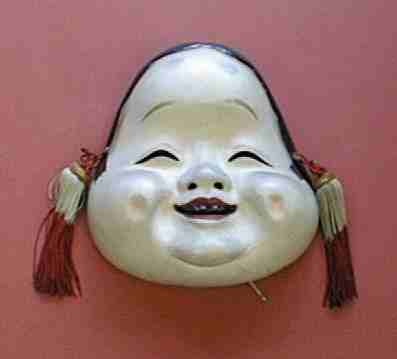
The mask is one of the most basic and recognizable of all forms, and for good reason. One way early humans made sense of the universe was to personify its forces, and the most visible form of personification was the face. Masks have long been central to religious rituals, serving as tools of transformation and bridges to the spirit world. They have figured in ceremonies intended to ensure fertility and raise the dead, make crops grow and rain fall, kill enemies, ward off evil and cure sickness. They have been used by soldiers and celebrators of Lent, astronauts and action heroes, hockey players and fencers, firefighters and welders.By ROBERTA SMITH Published: January 11, 2008
Here are some Japanese masks, i find them inspiring.





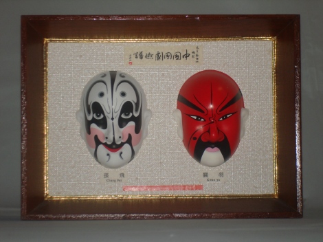
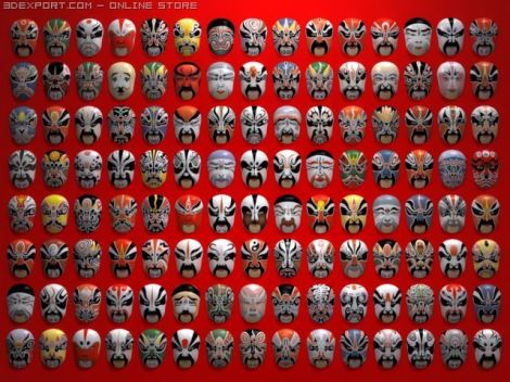
These are Chinese opera Masks that are in tradition forms.
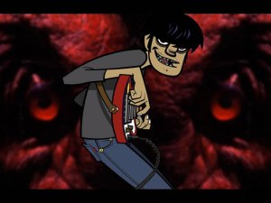
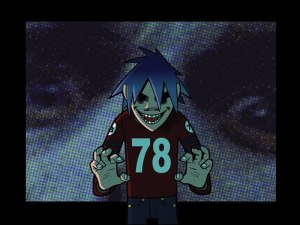
The video and creative characters from gorillaz.
http://www.babelgum.com/browser.php#play|SEARCH,channelID:136855,order:FEATURED|11,3015154
A series of characters from http://www.gorillaz.com, as a example, the characters have been developed to support the merchandise.
These characters have been used in different media such cd, dvd and web.They suggests well defind, as unique and cannot be mistaken for another character. In design principle terms, they have a high visual contrast to all other characters.
Although their proportions are not realistic, a scale still exists. this scale is exaggerated but remains recognizable to the viewer. even though a fully-grown adult does not have these proportions, a human baby does. it is the recognizable scale that is plausible in this metaphor. in terms of observation, many of these characters have been given baby characteristics. that is, their head is disproportionately big as compared to the body.
Features are exaggerated on each character. it is the artist’s deliberate choice to give the characters an antisocial appearance. this is achieved with smaller eyes, beady eyes, hidden eyes irregular sized eyes etc. the target group has been well considered as these anti-social visual cues would appeal to many rebellious or, want to be rebellious youths.






March 2, 2009
Personal Identity
Logo
is visual signs, and their form comes from the object they depict or from related associations. A logo can also be developed from a company’s initials or the name of the product. It is possible to combine letters and pictorial elements in a single logo. Certain letters provoke associations such as a feeling of lightness or weight. Use these associations as well as any other emotional messages the forms may carry. Here are some Logos are designed as Gestalt theory concept (pattern seeking), it defines the wedge that we cannot help but see as closed objects. Here are some Logos that defined the Concepts of Gestalt Principle.


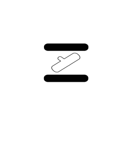
EXCISE ‘Grey Wedge’- Use gestalt Principle. 
The following works are one of my personal style guide component-Type Logo;
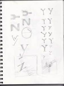
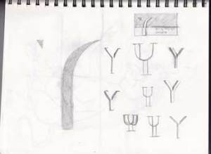
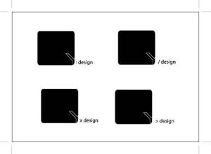
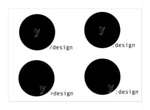
These logo’s are designed to represents myself – designer. As a part of my studies i am try to use simple design concept, such as minimize elements to suggest mnemonic device. each composition is my personal identity. by place the elements within organic form to achieve obvious visual impact. Overlapping and cropping to create a sense of movement that evoke the compositional area extends beyond the frame. Apply black and white color to create a depth is defined Proximity, the simple color also creates a strong contrast to achieve the primary definition.




Personal Identity
These are not the final design of my personal Logo; they gradually generated to become more appealing to a design definition, they will be continuously changing and growing during my study journey.
The following images are the steps of the design process, from sketches to digital images.


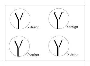
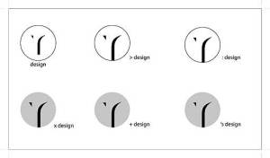
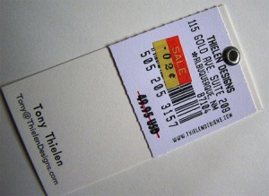
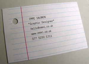
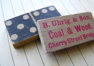
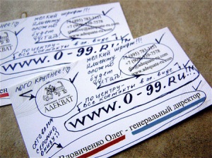
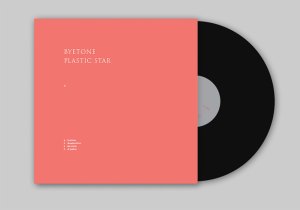
 Here are some creative design – Business card.









March 1, 2009
Yan Zhu
Design Journal
Admittedly, This is a note of my investigation that follows fundamental concepts of Design I am studying, it contains my work, exercises and resource: a summative project research, a constantly collection from some real-life examples of design, create by designers from across the nation.Design; the form fits function industrial outlook mass production. A discipline embraces functionality. Embellishment is reduced; push the boundary of design concept.